
By Sean Anthony, UX Intern
When I began my User Experience (UX) internship with SolarSPELL, I knew I’d be applying what I’d learned in ASU’s MS in User Experience graduate program to the needs of a real-world organization. What I didn’t expect was how deeply the organization’s mission would reshape how I think about design, purpose, and the kind of work I want to do in the field of UX.
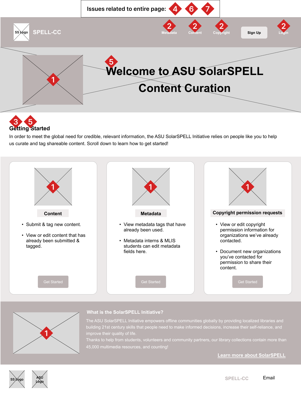
Over the past several weeks, my work has focused on the UX research side of things, conducting accessibility audits of two major SolarSPELL interfaces: the East Africa Agriculture Library (an offline digital library offering agricultural resources and training materials) and the SPELL-CC site (a new content curation platform supporting SolarSPELL’s digital libraries).
What is “accessibility” in the context of UX design? It means ensuring that digital products can be used and understood by as many people as possible, including those with disabilities or limitations that affect how they perceive or interact with technology. It’s about designing for diversity so that interfaces are not only functional but inclusive, allowing everyone to engage with content, regardless of circumstance.
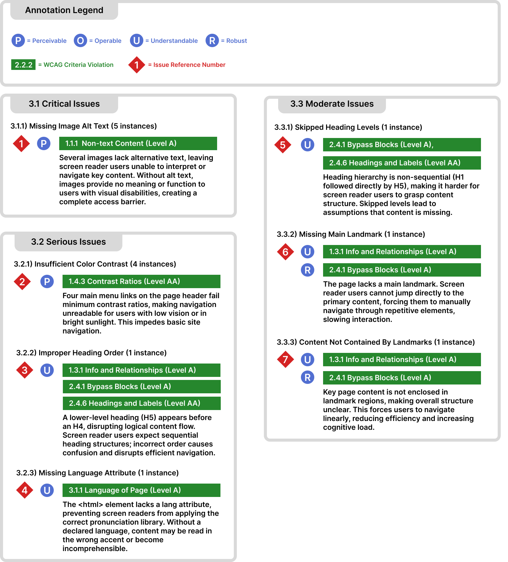
Using what’s called the POUR accessibility framework (Perceivable, Operable, Understandable, and Robust) and the Web Content Accessibility Guidelines (WCAG), I identified a range of usability and accessibility barriers, from missing alt text and poor color contrast to inconsistent heading structures and lack of semantic landmarks.
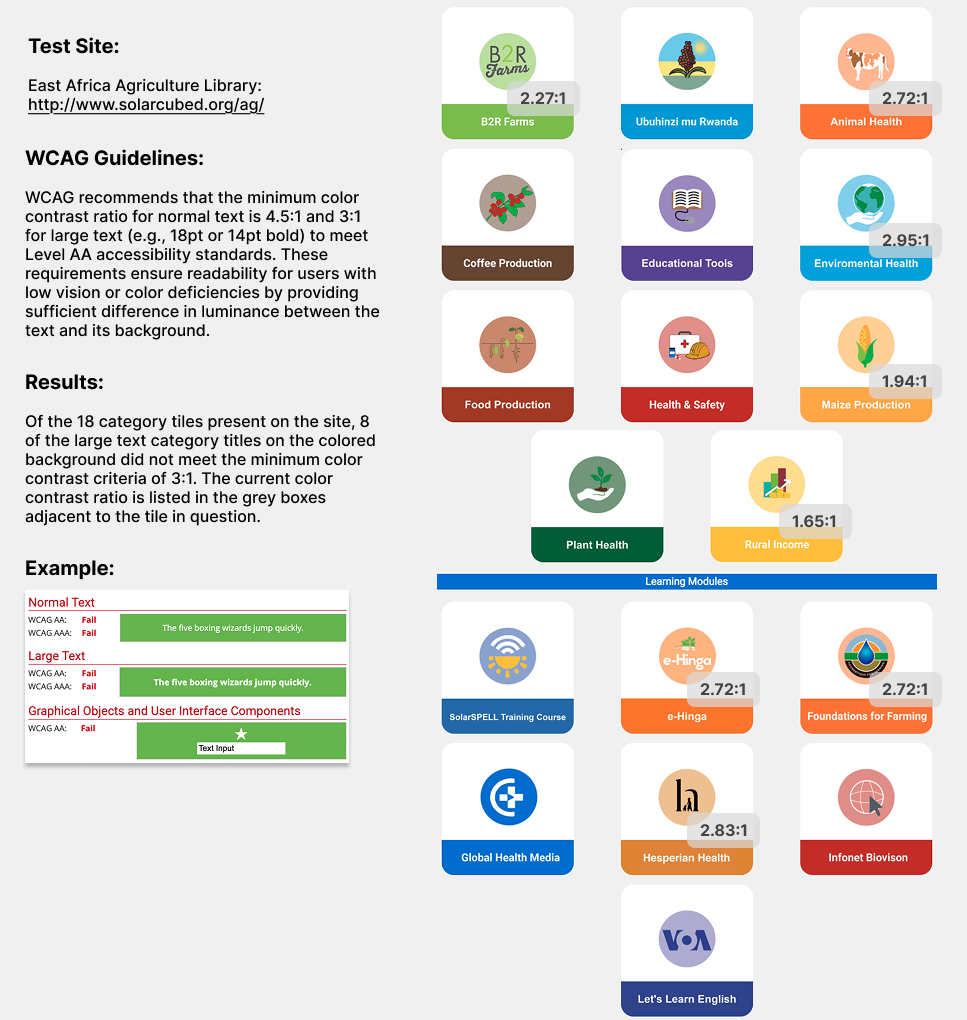
These types of accessibility issues not only impact users with disabilities and block access to content, they also can also lead to problems for regular users with what are called temporary or environmental disabilities. For example, during my audit of the East Africa Agriculture Library, I found that several category tiles failed to meet recommended minimum color contrast requirements. For users with low vision or some form of colorblindness (which can affect 4.5% of the general population, or roughly 1 in 20 people), this meant critical agricultural resources — like Maize Production and Rural Income — were effectively invisible. Even for fully sighted users, poor contrast can cause readability issues in bright outdoor environments, where some educators may actually access SolarSPELL materials.
For all issues, I clearly documented the problem, mapped it to the corresponding WCAG criterion, and developed actionable recommendations. I also created annotated wireframes in an attempt to help developers better visualize exactly where these issues are occurring on the respective interfaces themselves. In many cases, small design adjustments (e.g., ensuring proper heading hierarchy or improving color contrast) could make a profound difference for users.
But beyond the technical findings, I feel that what I’ve learned through this process has been more profound. Working on SolarSPELL’s accessibility audits has challenged me to think differently about what “user experience” really means. When your users include educators in remote villages, or learners accessing digital resources for the very first time, you realize that accessibility isn’t a nice-to-have; it is the foundation of inclusion.
As Kat Holmes, author of Mismatch: How Inclusion Shapes Design, writes, “Inclusion happens when you design for the edge, not the average.” Working on SolarSPELL’s library interfaces has shown me just how true that is. Designing for users at the margins (e.g., those with limited access, connectivity, or experience) tends to create better, more human-centered solutions for everyone.
I’ve also learned to appreciate what I think of as the resourcefulness and intentional simplicity that define SolarSPELL’s approach. Unlike the typical tech startup model of “more features, more engagement,” it seems to me that SolarSPELL’s design philosophy is about restraint, prioritizing clarity, efficiency, and cultural relevance over visual flourish.
Every design choice has to withstand the realities of unreliable power, limited connectivity, and varying levels of digital literacy. It’s UX stripped back to its essence: empathy, usability, and purpose.
This internship has also sparked some personal reflection on where I want to go as a UX professional. Working with such a values-driven, humanitarian organization has shown me that meaningful design doesn’t just have to be about solving usability problems; it can be about aligning design decisions with human needs and social good.
I’ve realized that I’m not really interested in creating experiences that exist solely to sell products or capture user attention. I want to work for organizations that use design as a tool for empowerment, education, and equity — like SolarSPELL does.
Ultimately, this experience has made me think that good design has less to do with aesthetics or conversion metrics, and more to do with dignity, ensuring that everyone, regardless of circumstance, can access information and opportunity. As an aspiring UX researcher, I can think of no better mission to design for.
The ASU SolarSPELL Initiative empowers offline communities globally by providing localized libraries and building the 21st century skills that people need to make informed decisions, increase their self-reliance and improve their quality of life. To get involved, visit https://solarspell.org/student-opportunities.